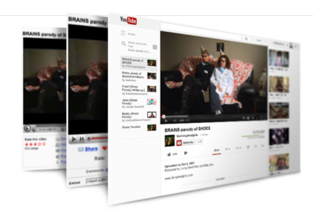
YouTube has redesigned its site with a new focus on subscriptions, original content and individual channels.
The site now resembles the “white and grey color scheme and sparse layout found in apps like Google+ and Google Now,” writes The Verge. Google encourages subscriptions and says it is “just like adding your favorite shows to your DVR,” underscoring the shift towards a more personalized YouTube experience.
“YouTube is even better when you subscribe,” suggests the video site on a page titled YouTube Is Getting Better. “Now when you subscribe to your favorite channels, we will add them to your Guide and make them available on every page of the site, and on your mobile device, tablet, and TV.”
The actual viewing experience is also a bit different, as the video plays closer to the top of the screen and playlists have been moved to the right of the screen to make it easier to find videos on the same channel rather than just related videos.
“This is no ordinary channel guide,” the site explains. “The YouTube Guide puts the channels you love at the top of the list and always shows you how many new videos are waiting for you.”
“With YouTube investing heavily in its own original channels, it only makes sense that it would try to make that content as easy as possible to access and navigate through, and the new design is a big step in that direction,” writes The Verge.

 YouTube has redesigned its site with a new focus on subscriptions, original content and individual channels.
No Comments Yet
You can be the first to comment!
Leave a comment
You must be logged in to post a comment.